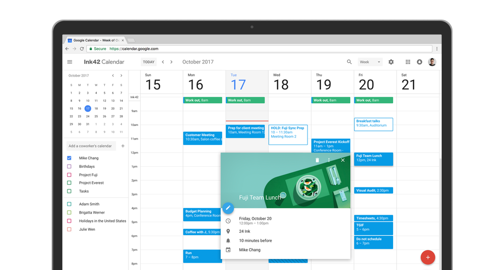
Today, this new update has begun to roll out as the new UI for the Google Calendar has arrived. Google Calendar for web has now been redesigned to look and feel more like the mobile app. Google says that users have enjoyed the mobile app and this new web version of the Calendar has been built to match the material design style of the app. This new and improved Google Calendar for web now comes with a modern color pallet and a material design style. The company has added some new features too. Let’s take a quick look at some of them:
What’s New in Google Calendar:
See Conference Room Details
This is a new feature which will help business users a lot. Admins can now enter the details of the conference room such as it’s location, size, accessibility, A/V capabilities and more. Moreover, it is now possible to manage the booking status of the conference room too, as those looking forward to make a booking will be able to see the availability details of the room among different time slots.
Better Formatting
Google has also improved the way formatting is handled on Google Calendar for web. Users can also add hyperlinks to calendar invites which makes it easier to link documents and spreadsheets directly via calendars.
Manage Multiple Calendars
Another much-demanded feature that has made its way to Google Calendar for web is the ability to manage multiple calendars. This makes it easier for users who have to handle multiple calendars – such as one for different teams or for individuals. Calendars can now easily be compared. Source: Google

